

ShadowStats.com, the web site for Shadow Government Statistics, provides analysis behind and beyond government economic reporting. The site is maintained by John Williams, an economist with an A.B. in Economics, cum laude, from Dartmouth College in 1971, and was awarded a M.B.A. from Dartmouth’s Amos Tuck School of Business Administration in 1972, where he was named an Edward Tuck Scholar. During his career as a consulting economist, John has worked with individuals as well as Fortune 500 companies. All charts shown are with the approval of ShadowStats.com.
ShadowStats.com is a wonderful counter-balance to the distorted data distributed by the federal government. For example, the Consumer Price Index (CPI) no longer measures true inflation. It now under-reports official inflation, which adversely impacts, for example, senior citizens on Social Security.
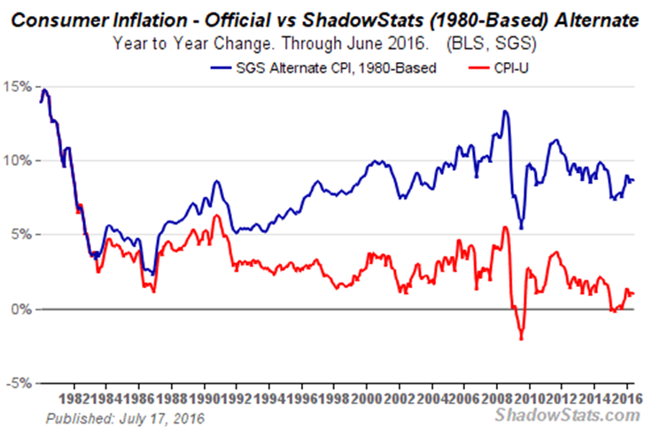
Chart 1 shows the impact in 2016 of under-reported inflation. Based on government reporting senior citizens could receive less than a 2% increase in Social Security instead of the 8% or so they actually need to meet current financial needs. Even more critical, “Understated inflation used in estimating inflation-adjusted growth has created the illusion of recovery in reported GDP (italics my emphasis, ShadowStats.com).”
Chart 1
Unemployment is another distorted statistics for the federal government. Table U-3 presents the most common unemployment data to the public. This Table fails to include long-time discouraged workers who have basically dropped out of the work force. This failure to include these workers makes the unemployment rate in Table U-3 look good but it does so by under-reporting the true picture.
Table U-6 includes the long-time discouraged worker but still under-reports the true picture of unemployment. This is why any data produced by the federal government, in general, and the Obama administration, specifically, cannot be trusted. The truer picture is provided by the Shadow Government Statistics (SGS).
Chart 2
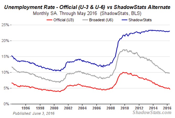
Notice the difference between the government’s 5% unemployment rate and the SGA 23% unemployment rate. How can there be such a difference. Part of the difference can be explained in Chart 3.
Chart 3
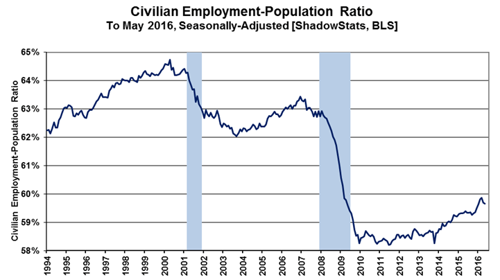
The ratio of workers to population has plummeted under the Obama administration. Another way to look at the economy is through the Labor Participation Rate, Chart 4.
Chart 4
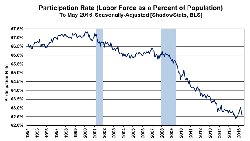
The Labor Participation Rate started falling with the recession of 2009 but accelerated under the forced introduction of Obamacare. Because of Obamacare full-time versus part-time rulings, employers started moving more workers to part-time status to avoid the onerous penalties of Obamacare. Additionally, Obamacare introduced major uncertainty into the workplace causing employers to be even more cautious.
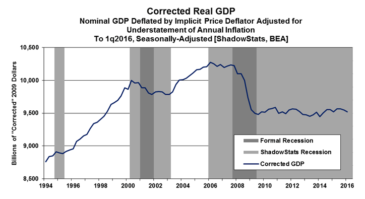
When this data is reflected in Corrected Real GDP, one can understand that historically U.S. GDP grew an average of 4% but under the onerous regulations of the Obama administration, GDP flatten at less than 2% (Chart 5).
Chart 5
 Since President Obama has been in office, the economy has flat-lined. Yet, in Elkhart, Indiana, earlier this year, Obama stated, “By almost every economic measure,” he declared, “America is better off than when I came here at the beginning of my presidency.” Really? The reader should draw your own conclusion.
Obama also said, “We spend less on domestic priorities outside Social Security, Medicare, and Medicaid … than we did when Ronald Reagan was president. … You can look it up.” Others did. “As a share of GDP, domestic discretionary spending is 3.4% of GDP this year. It was 3.3% when Reagan left office. Under President Clinton, it fell to 3.1%. What’s dropped is military spending, which was 5.5% of GDP in Reagan’s last year and is now 3.2%. Given the global tensions today, that’s not exactly something to brag about . . .
And what’s with his excluding Medicaid? Obama has dramatically increased Medicaid spending. And he’s set the country on a path where federal spending as a share of GDP will continue to climb well above historic levels. Plus, he said in his speech that he wants to expand Social Security. It’s like saying, aside from the massive bar bills I’ve been piling up, my spending is lower than it was before” (John Merline, Investor’s Business Daily, 6/3/16 http://www.investors.com/politics/commentary/obamas-message-to-middle-america-the-economy-is-doing-great-and-if-you-dont-think-so-youre-dumb/).
Obama’s wonderful economy is not so wonderful after all. Our economic rate of growth is the primary metric of America’s strength and health as a country. In April 2016, the Commerce Department announced that the economy “expanded “ at the slowest rate in two years: GDP grew at .5% after a fourth quarter 1.4%. A comparison between Ronald Reagan and Obama was made. Reagan grew the economy at a healthy 3.5%; Obama grew his at a paltry 1.5% for his presidential terms.
Barack Obama has the opportunity to leave office with the fourth worst economic record in U.S. presidential history.